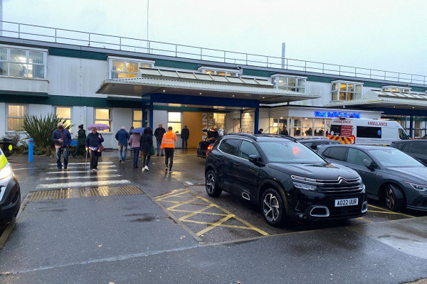
Liverpool John Lennon Airport
Signage that enhances the passenger experience and increases dwell-time and spend
Liverpool John Lennon Airport (LJLA) tasked Mima with the creation of a clear wayfinding strategy to enable passengers to get through the airport as quickly and efficiently as possible and to consider how to encourage passenger dwell in specific areas, to enhance the passenger experience and increase spending whilst integrating into the Liverpool John Lennon Airport brand and vision.
Our Task
Along with a clear wayfinding strategy to enable passengers to get through the airport as quickly and efficiently as possible, we were tasked with considering how to encourage passenger dwell-time in specific areas and to enhance the passenger experience whilst increasing passenger spending. LJLA also wanted to maintain its reputation as an easy, fast and friendlier alternative to some other larger airports in the area.

Our Solution
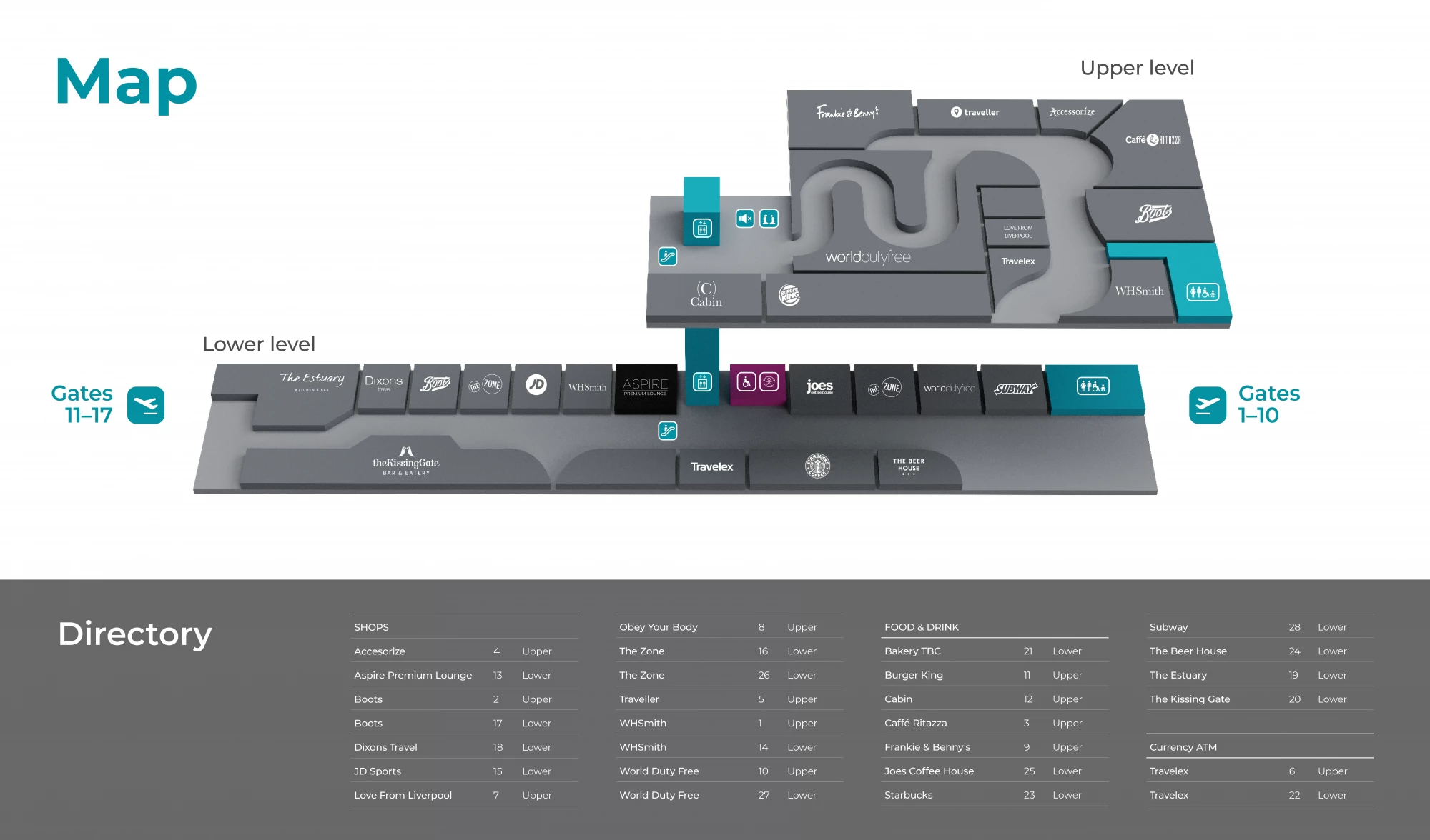
One of the main challenges of the project was finding the departure gates. Historically, the airport circulation routes were designed to flow in a different direction and the layout has since changed, which meant that sightlines to main vertical circulation points and gates are visually blocked in some areas.
The Mima team conducted behaviour-led visitor observations and interviews to gather insights and identify areas for focus and optimisation. We ran interactive workshops with key airport stakeholders and front-line staff to map the passenger journey and review current issues and prototype future interventions.
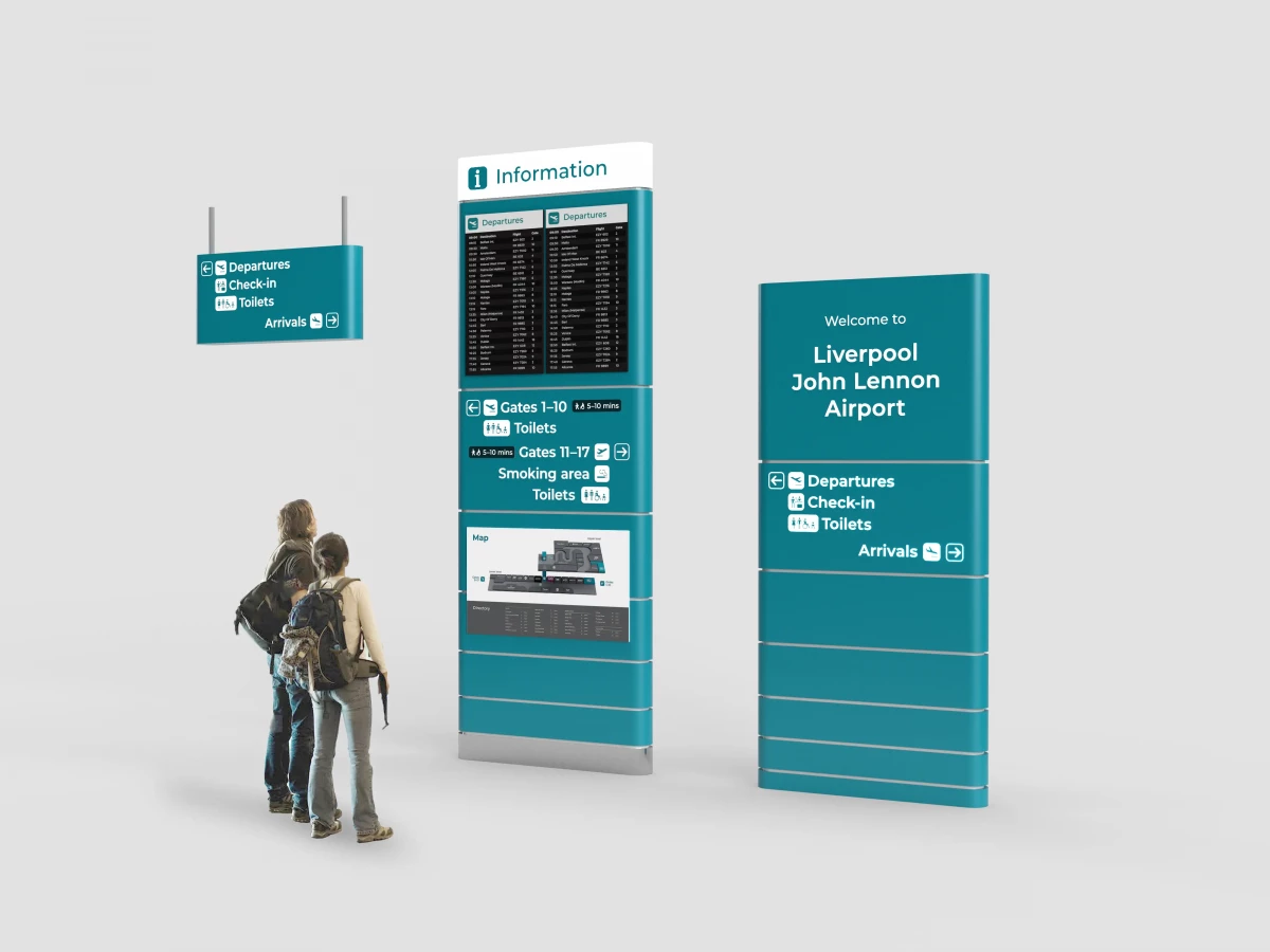
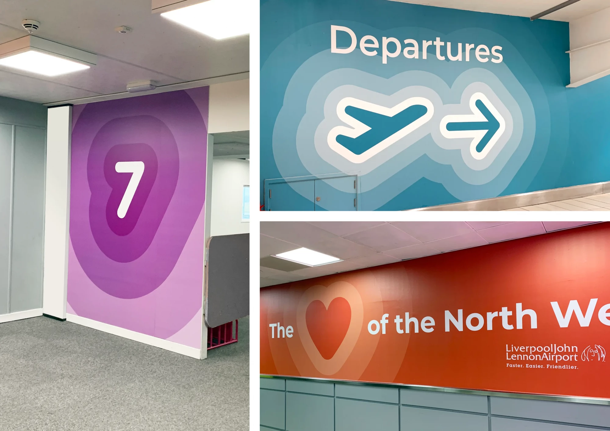
We introduced a new set of guidelines for communication, based on the nudge theory. Using a friendly tone of voice that fits with the LJLA airport vision - 'Faster, Easier, Friendlier'- the aim was to create recognisable, quick-read wayfinding interventions with personality and to guide the passenger with confidence as they travel through the airport. The wayfinding scheme included a brand-new colour palette that enabled the sign products to stand out from the environment. The shape and form of the signs are soft with rounded edges that accentuate the graphics and help the suite of physical signs to feel approachable and friendly. A new set of pictograms were designed to complement the typeface and to aid recognition.
To highlight the vertical circulation routes and departure gates for passengers we introduced a series of large graphics that could be seen from a long distance. The graphic styling featured on walls as supergraphics to highlight directions, gate numbers, airport marketing and digital gate information screens.
Following additional consultation with our access consultant Emily Yates (who is a regular flyer from Liverpool), access groups and the team at LJLA, it was established that the Special Assistance operation also needed an overhaul. The signs now feature a new accessible-branded dedicated direction that can be picked out from all other destinations quickly and efficiently, the assistance desk also got a redesign to match the information design and colour scheme of the wayfinding system, elevating the prominence of the assistance desk within the check-in hall and making it much easier to find.
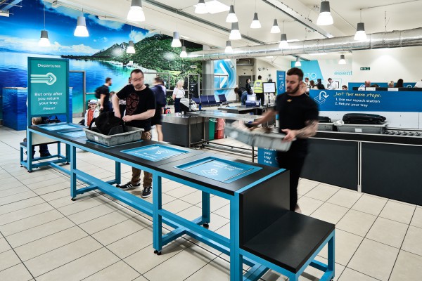
Mima designed a whole new visual communication and wayfinding kit of parts that spanned across all passenger touchpoints. At this time, due to the pandemic, only the departure gate supergraphics have been installed so far with the roll out of the wayfinding signage to be implemented at a later date.