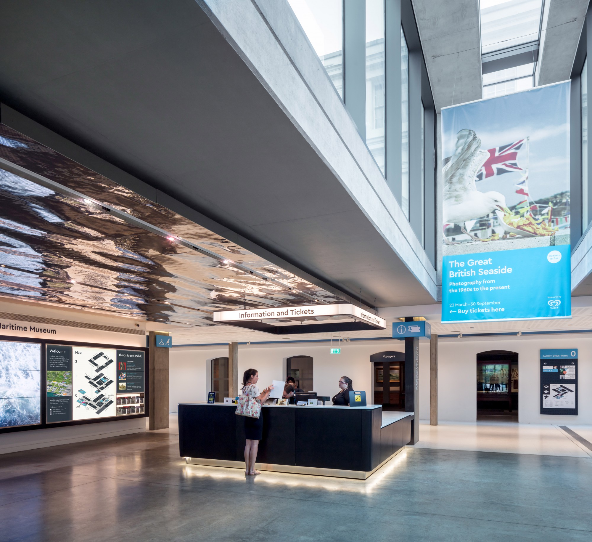
National Maritime Museum
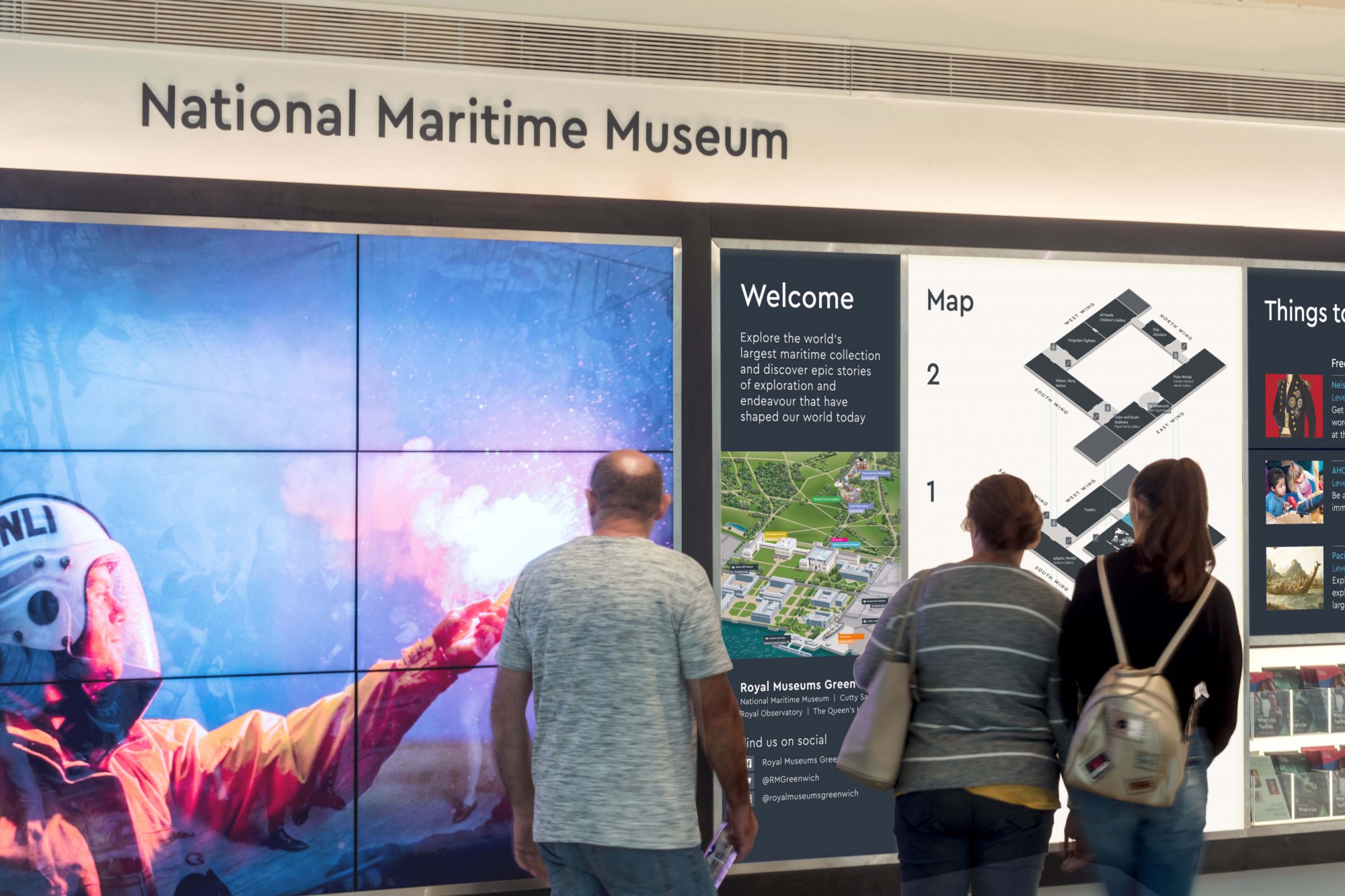
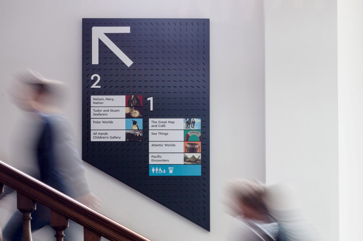
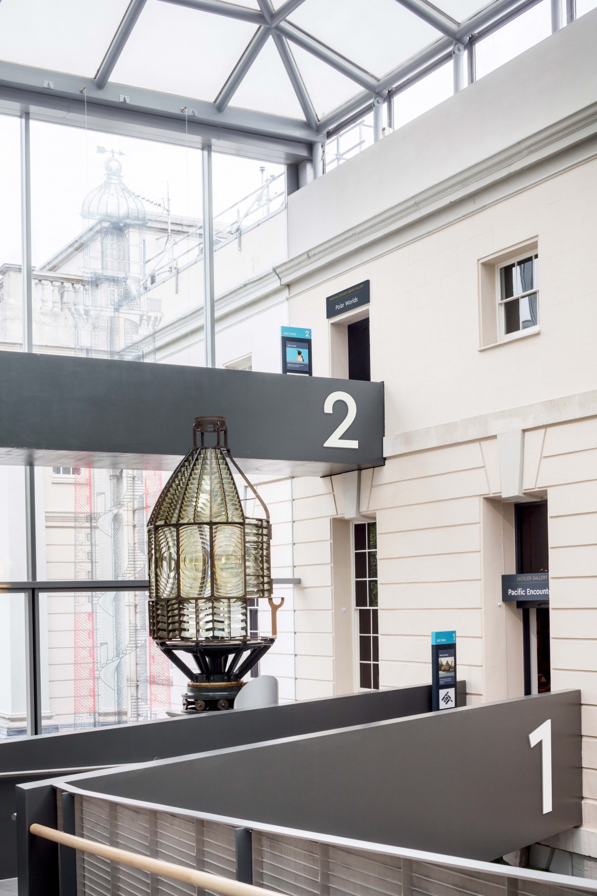
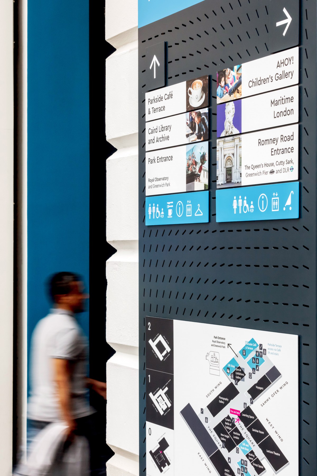
Wayfinding to encourage museum exploration and discovery
The style of the signage is easy to understand for a range of our visitors and the imagery works well to give an insight about gallery content. The team are not being asked as many questions about locations of galleries and how to reach the upper floors as the visitors are able to locate them using the wayfinding.
To support the opening of four new galleries opening in September 2018, Mima were contracted by Royal Museums Greenwich (RMG) to understand the holistic visitor experience, which would inform the development and design a new wayfinding scheme for National Maritime Museum in Greenwich, London.
Our Task
To support the opening of four new galleries opening in September 2018, Mima were contracted by Royal Museums Greenwich (RMG) to understand the holistic visitor experience, which would inform the development and design a new wayfinding scheme for National Maritime Museum in Greenwich, London.
The Front Of House staff all believe that the wayfinding in place is working as intended, encouraging visitors into the galleries on the upper floors."
Our Solution
To begin our research and humanise the problems at hand, we talked with both staff and visitors. In response to these insights, a key part of our strategy was identifying these areas as a basic need and focusing on directing to entrances and onward travel.
We used a variety of ethnographic, qualitative methods to understand visitors and develop a holistic view of their experience within the museum. Behavioural observations helped to identify visitor pain points.Interviews with visitors gave us a deeper understanding of causes behind frustration or confusion with the building layout, such as: exhibitions or notable pieces they weren’t aware of, they had missed or couldn’t find; entrances, exits, vertical circulation and onward travel.

Other Case Studies
-
Understanding passenger behaviour to help create an award-winning station
London Bridge Station
-
Using technology to revolutionise how two control centres can deliver a single operation
Network Rail & South Western Railway
-
Innovating participatory design to create a revolutionary control room
Ocean Infinity
