The British Library
Bold wayfinding that creates high visibility with cultural touchpoints
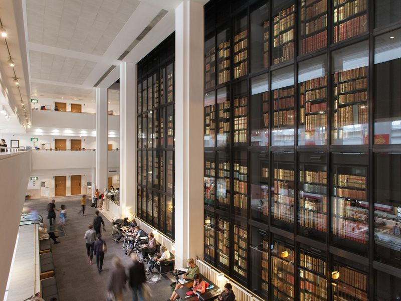
The British Library site at St Pancras welcomes 1.5 million visitors a year across its research, culture, learning, business and commercial offers. The signage to welcome, orientate and encourage passers-by looked tired and worn and it also didn’t allow the library to showcase the breadth of their diverse offer and what visitors can experience behind the gates.
Our Task
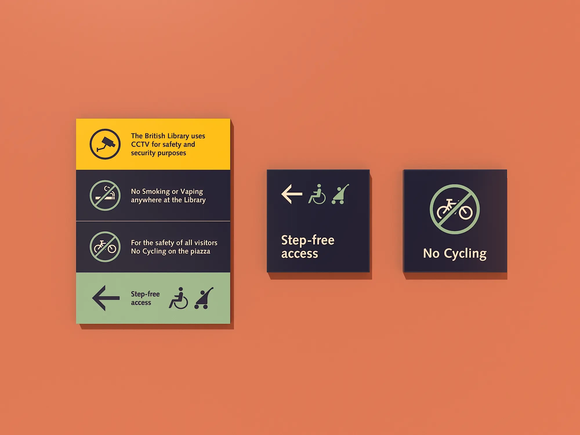
Our key objective was to provide strategic insight into the external signage to help provide clarity over the placement of key messaging to help entice passers-by, as well as promote the breadth of the overall offer, including changing exhibitions and campaigns. As well as this, our scope included the rationalisation of all the functional signage (such as CCTV, No Smoking etc) and to provide easy-to-use template designs for the library’s in-house design team to implement.
Our Solution
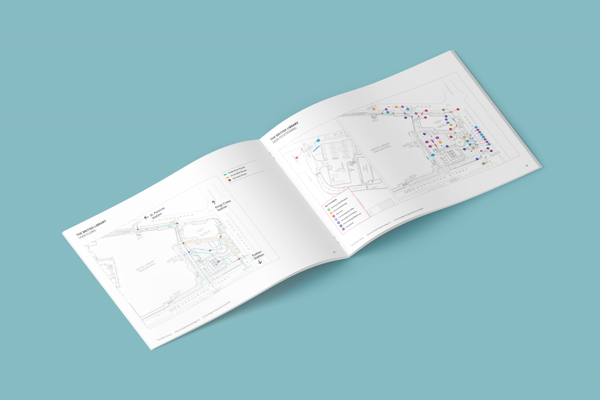
Our initial task was to complete an audit and survey of existing signage and review the previous ethnographic studies that had already been undertaken. The studies showed that identification of the Library at all 5 entrances lacked clarity of the offer.
We analysed the pedestrian flow routes in and around the site to determine what levels of information would be required at each stage of the journey, identifying key locations for positioning new signage and adjusting existing. This analysis included a review of the accessible directional information provision.
At the British Library there is a lot on offer, so we undertook a thorough review of the categories and different levels of attractions in order for us to compile an information hierarchy that could be flexible when needed, adapting to the changes in priority of campaigns.

Our Solution
Our strategy report identified a rationalised sign and banner location plan with a clear role for each sign so that future updates can be rolled out with ease. The strategy made recommendations for text size and reading distance, colour and contrast for legibility and suggested wording.
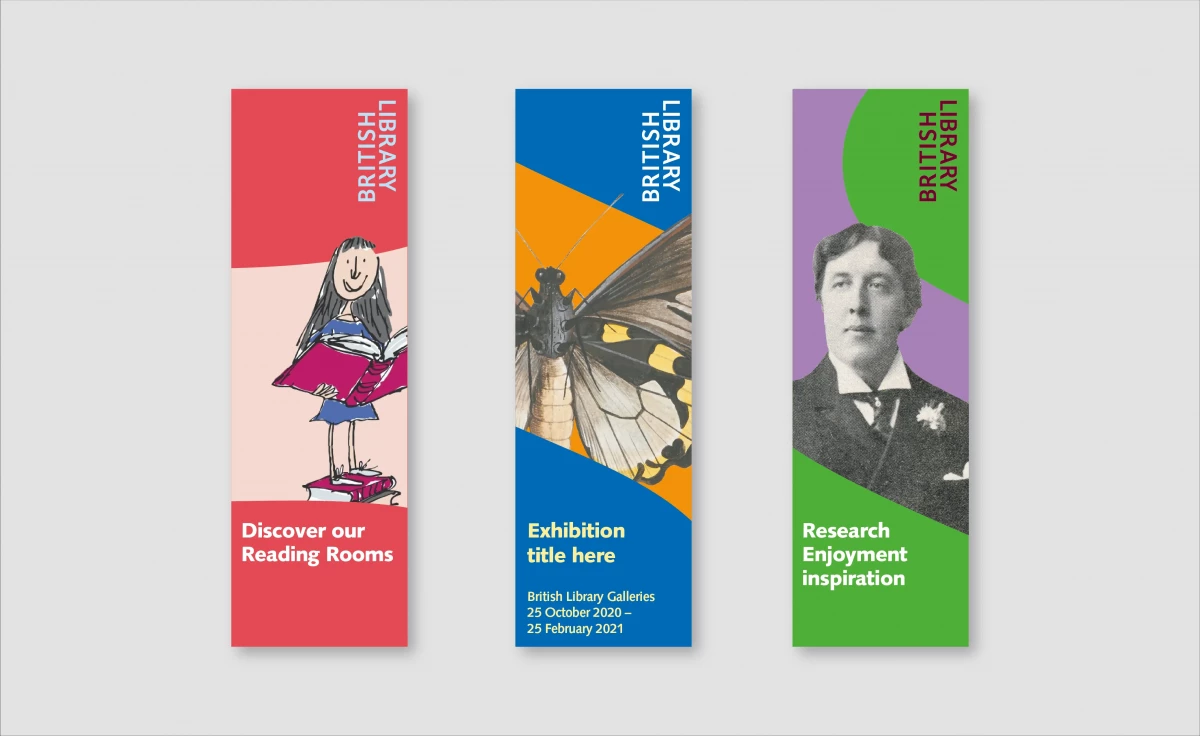
The design template of the banners is bold and exciting in the hope to capture the attention of passers-by. The designs feature a subtle use of cropping of the iconic British Library logo letterforms to help define simple shapes that play with the imagery and text and the new British Library colour palette. Our concept was to focus on some of the more iconic characters from fiction to help bring the message alive and support the messages, for example, Alice promotes the use of the Cafés and Matilda invites you to experience the iconic Reading Rooms.
The functional signage underwent a transformation in size and simplicity with high visibility and consistency as its core. The graphic design templates we created provided a range of options to be used and adapted by the in-house design team for future updates and new exhibitions.