University of York
Wayfinding to connect three campus sites spread across 400 acres
University of York had a challenging situation with a large, dispersed campus.
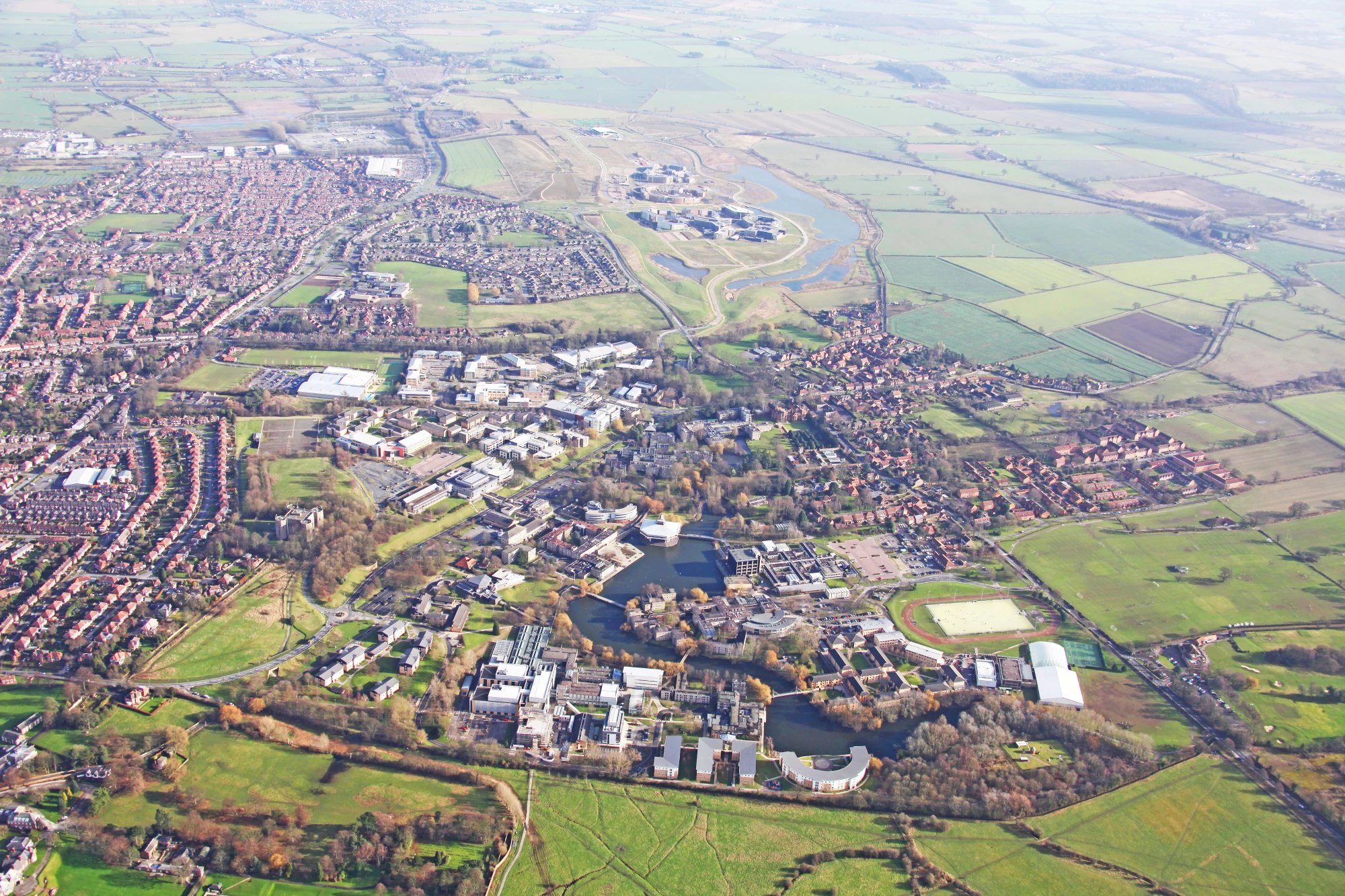
The university is a mixed-use complex totalling more than 400 acres, split into 3 principal campuses. These encompass accommodation and academic facilities for 45,000 students and 3,000 administrative staff. The site also includes a commercial science park, retail outlets, restaurants and a flagship Sports Village located on the East campus.
University of York wanted to ensure that the visitor experience on campus was aligned with its brand positioning and future aspirations. To do this, they recognised that a new wayfinding strategy & design was required.
Our Solution
We engaged in significant research on the site including talking to a large number of students, staff and other visitors. This was undertaken through extensive observations of user behaviour followed by interviews and workshops with students, visitors and staff. User personas were developed to support the design team in testing and evaluating the emerging design.
Our user research gave the University evidence and confidence in the subsequent design solutions.
Strategy
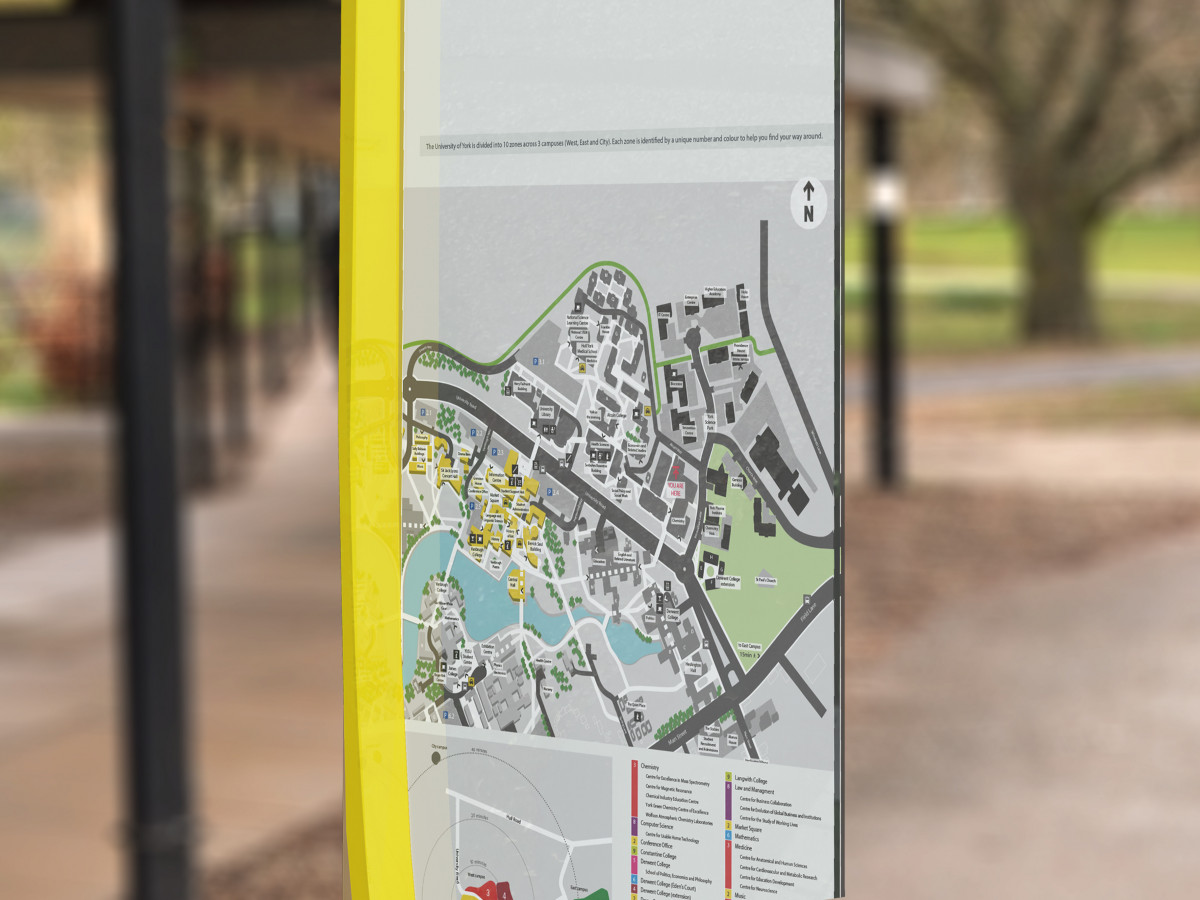
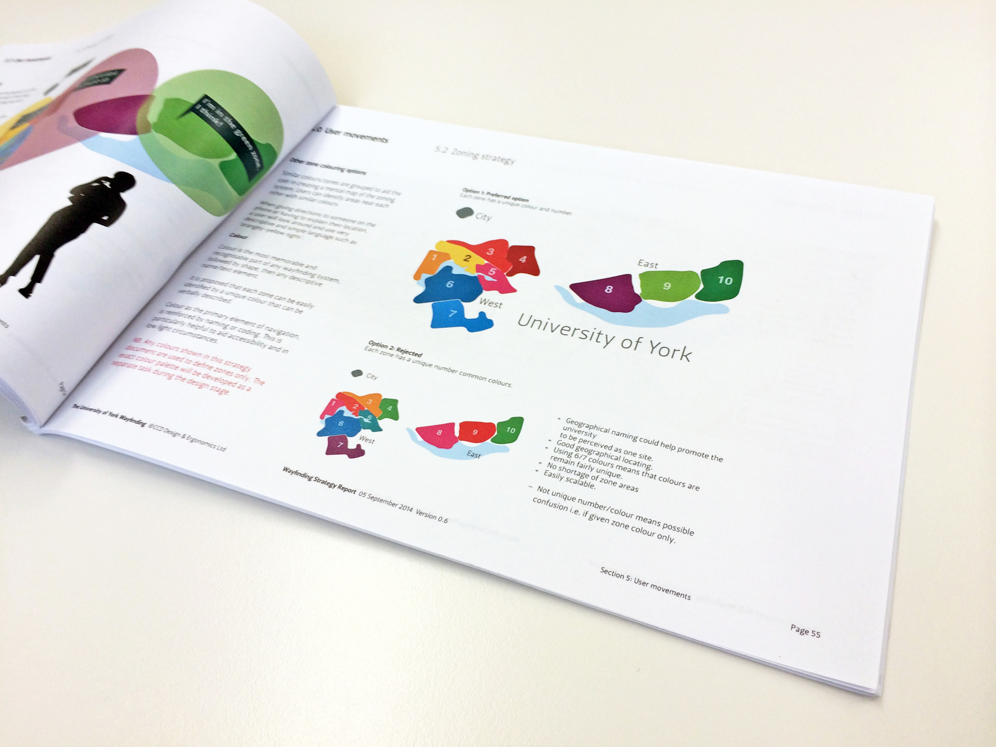
From our research, we developed a strategy based on zoning the campus and providing a clear hierarchy of information covering the various colleges and buildings that make up the university. The research also informed where signage needed to be located to support the main movement of people and the information content at each point.
A key aspect for the University was the accessibility of the scheme. We ran a series of workshops with different users to understand the difficulties and challenges they had in navigating the campus.
Our Solution
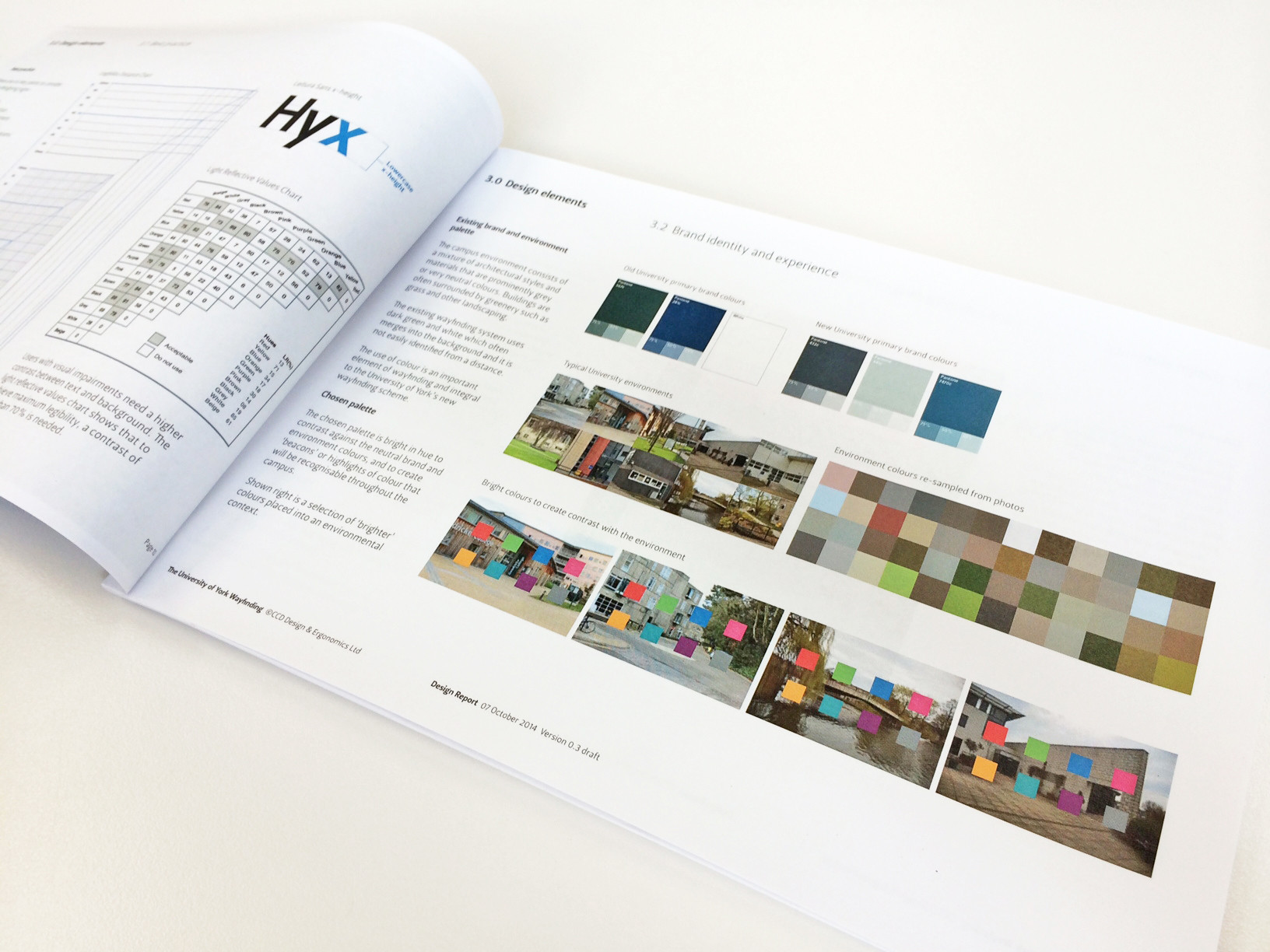
Our work has taken the new visual identity for the University and explored how to translate this across the campus. The result has been a stronger expression of the brand. For example, this has also addressed an existing weakness in the lack of boundary signage.
The product design solution that we developed included a glass totem design made of removable facets. This allows for cost-effective updates as the site develops. Doing this reduces the need to change signs, which would be unsustainable and inefficient. Additionally, we have considered the use of renewable materials for the totem structure and wider sign family design.