How to increase repeat visitors to your museum, exhibit or event 5 lessons from digital products and brands
Are you responsible for visitor experience? If so, this article is for you.
Unlike digital products, physical venues require visitors to make an effort to travel, often facing barriers such as accessibility, time, and cost. While digital products don’t face the same space and distance barriers, they do face tough competition, with the competitors one click away. Both place-makers and digital designers are working to do the same thing with slightly different constraints — how do you create experiences that attract visitors and keep them coming back?
Sometimes, it requires looking at another sector to see your challenges in a new light. For those working on in-person visitor experiences, I have collated some relevant examples from digital products and brands to show those same challenges in a new light. Here are my top five tips and insights to increase repeat visitors to your museum, exhibit, or event.
1 - End-to-end experience matters
2 - Dynamic content beyond four walls
3 - Lowering the barrier to entry
4 - Align with a bigger mission
5 - Embrace the unintended uses of your service
1 - End-to-end experience matters
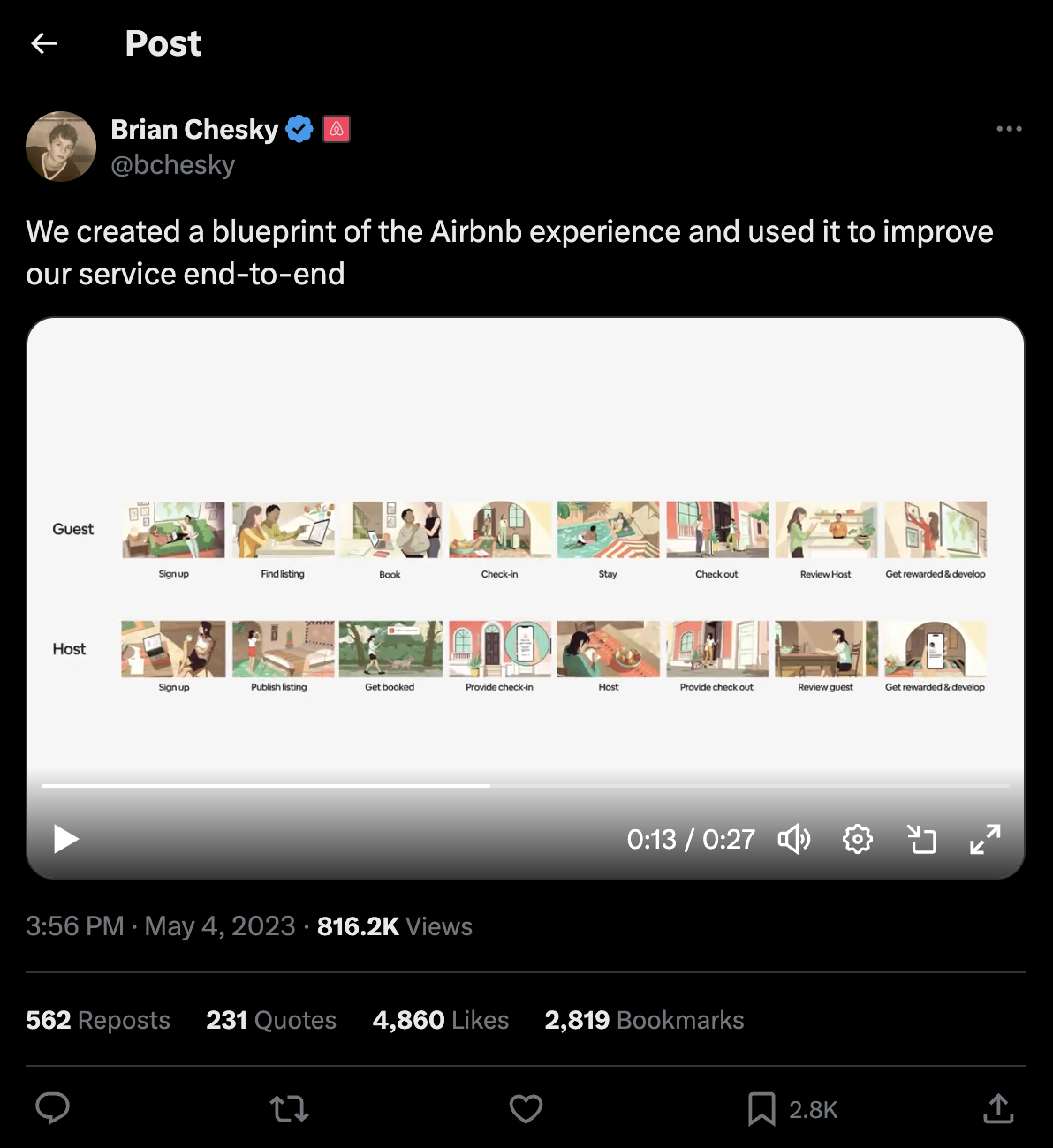
It’s important to think about the end-to-end experience, even the bits out of your control, that may provide incentives or barriers to users visiting your service. Airbnb published an 8-stage journey in 2023 describing the steps guests and hosts go through when using their service. They then mapped below how their digital product, services, and policies fit into these steps. This map is called a ‘Service Blueprint’, and is a standard tool used in digital design to understand users' end-to-end experience. For Airbnb, this map helped them orient their work around the goals of their guests, like ‘Book, Stay, and Check out’. Airbnb partners with its hosts to ensure a seamless experience for guests.
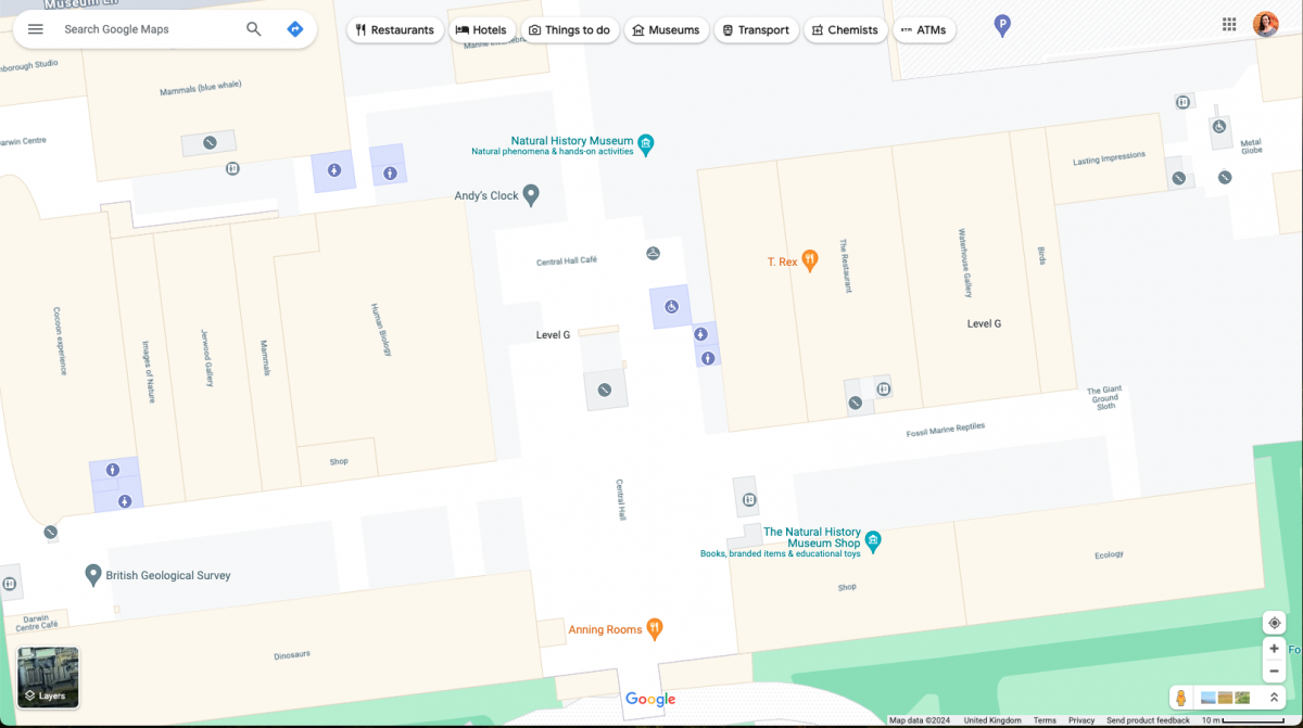
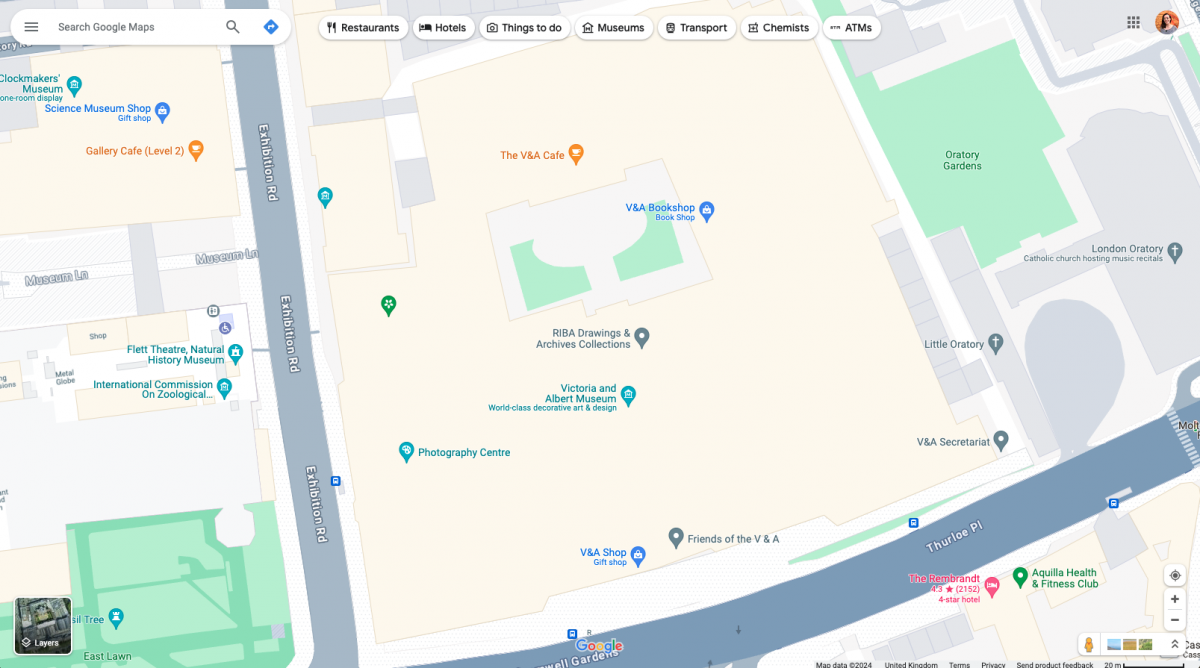
For venues, this end-to-end thinking can be applied to designing the experience for visitors. This means working in partnership with the different aspects of getting to your museum/venue, and what else you might do in the area. One starting point is to ensure your venue is easy to find on apps like Google Maps.
A seamless arrival can set a positive tone for the entire visit. For example, on my last trip to the V&A Kensington, I spent 10 minutes trying to find the entrance, which affected my initial impression. Although this might not seem like a big deal, the first and last impression is what is going to stick in visitors' memory about an experience and be the factors that inform their decisions to go again or what they share with others.
Going back to the Airbnb example, the platform has incentivised hosts to share arrival instructions and gets visitors to rate hosts on their communication. A negative experience here could have an impact on your rating as a host, as well as your trust in Airbnb as a platform.
2 - Dynamic content beyond four walls
You can move away from the idea of static content and that the boundary of your experience is your four walls. For museums and exhibitions, this can be tricky when the main thing that is offered is static exhibitions that don’t change often. Once visitors have seen it once, that is it, they don’t have a reason to be back until there is a new exhibit. In contrast, for digital products, this rapid production and change of content is easy. For projects in the built environment, dynamic experiences are possible but it requires a bit of thinking outside of the box. And no, the answer doesn’t have to be ‘put a screen up’.
One of my favourite museums is the Museum of Food and Drink (MOFAD) in Brooklyn, New York. I visited when they were exhibiting ‘Chow’, an exhibit on Chinese-American food history. Whilst they had a fixed exhibit, elements of it changed for the visitor, enabling delightful discoveries; like making your own fortune cookie and sampling food made by an in-house chef that linked to the exhibit you had just walked through. The fact that the exhibition was personal to me while I visited gave me an expectation that when I came back, it would also be something new to see and maybe meet some of my other needs, like lunch. Depending on the day, the event, and the time, there was a lot to explore about the theme, including their online content, events and a map highlighting the Chinese-American restaurants you could explore in the city.

3 - Lowering the barrier to entry
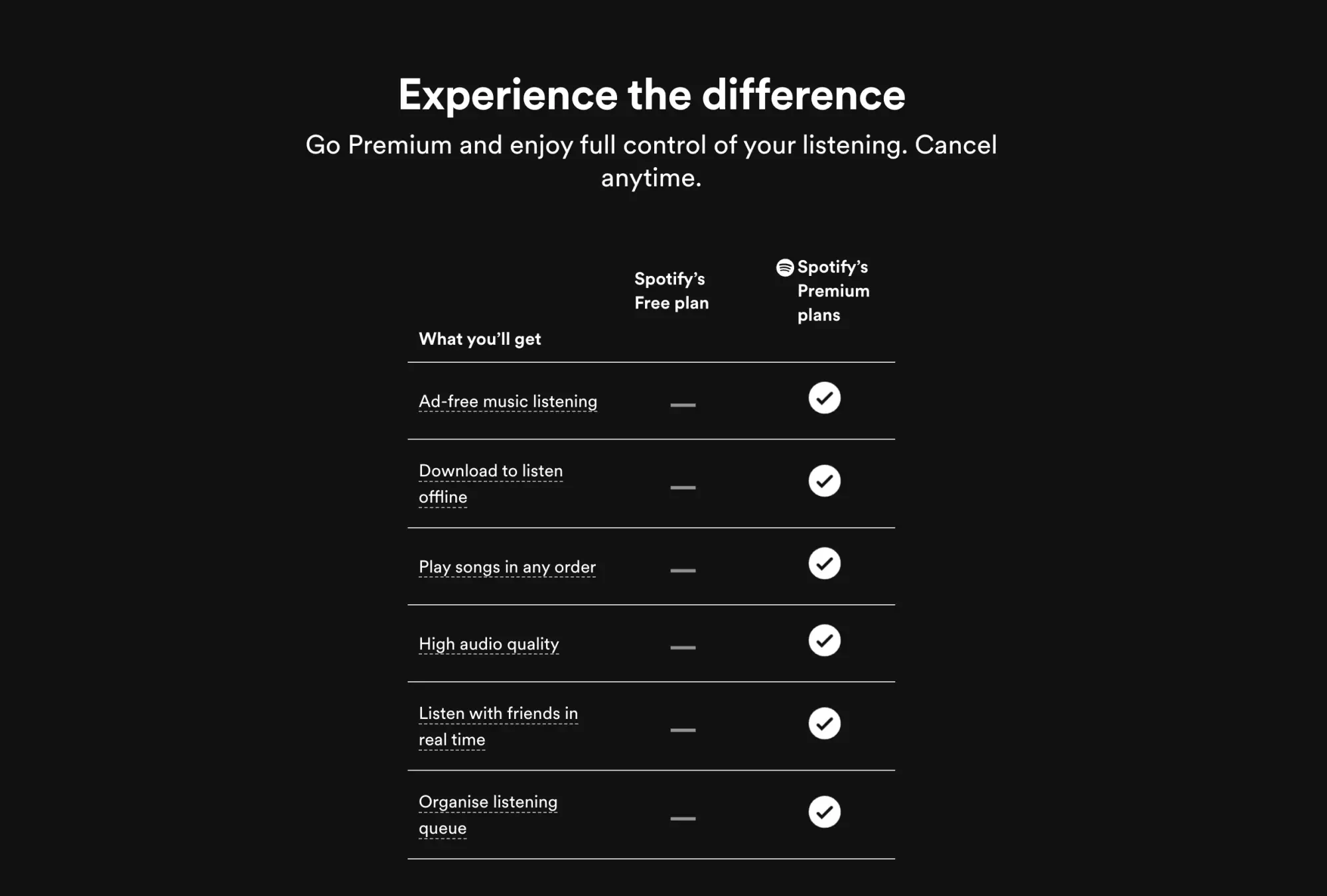
Many digital products offer free services or trials to attract users, with monetisation options available for enhanced experiences. The goal is to lower the initial barrier to entry to encourage more users to try the product. Spotify is an excellent example of this. It provides a free service that gives you all the music you want but a paid-for service without ads. People are paying for a ‘no interruptions’ experience, not the music. Would Spotify have all their customers without the free service? I would think no.
Behavioural science has some things to say about how people value what is considered free. This principle is called the Zero Price Effect. When something is labelled free, we attribute greater value and benefit to it and thus will work harder to get it. A demonstration of this is free shipping. (Source: www.microbizmag.co.uk)
45.6% of people say free delivery makes them more likely to buy from an online retailer.
That makes free delivery 3 times more likely to influence people to buy than a recommendation from a friend.
Half of the UK population is prepared to spend more in order to qualify for free delivery.
When we think about visitor experiences, we can design pay models that help visitors perceive the value of your service highly as well as make services more inclusive at the same time. Could museums subtract the cost of your travel from your entry ticket? From the users’ perspective, they may be willing to work harder to get free travel compared with visiting another museum.
4 - Align with a bigger mission
Being a loyal member, is supporting your favourite football team, even when they are playing kinda badly. Many digital products and brands that align with broader values, identity and missions resonate more deeply with their audiences. Some examples include Strava, Waze, Vinted or Monzo. One brand (although not digital) that has dominated loyalty is Oatly. They went from an obscure brand to one of UK's most recognised alternative ‘milks’. They used the power of messaging, creating a sense of rebellion and activism towards a plant-based diet. ‘It’s like milk but made for humans’ was one of their original slogans. Instead of purchasing milk being a decision about what was the cheapest, it became a decision about your ideals and how your milk purchase aligned with your values.
Many other organisations have used this values-based decision-making approach to market their products away from price-based decisions. This is why explaining how your service is part of a bigger mission is so important, as it helps people see you as part of their identity and build you into that relationship. Recently, we worked with a botanical garden, helping them align their visitor experience with their mission of sustaining biodiversity and knowledge, making visiting the garden part of a values-based decision.
5 - Embrace the unintended uses of your service
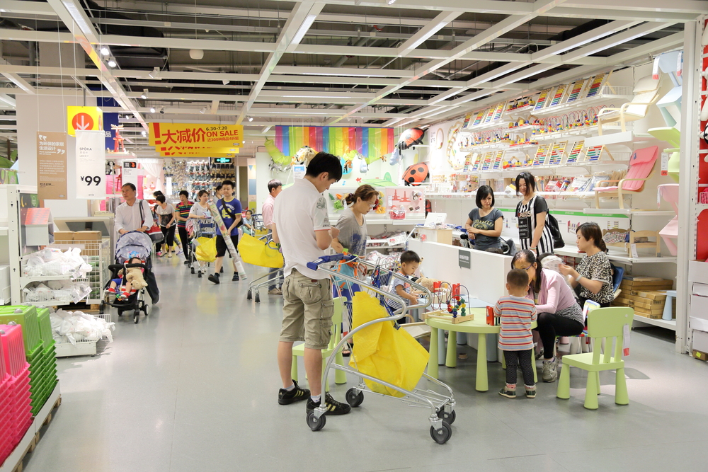
Embrace the functions your service has beyond what you expected. Google Maps Street View, originally designed to be a navigation tool has been used for the discovery of previously unknown archeological sites. When there is a drought season, previously unseen markings to the soil can be discovered in the street view photography. This has resulted in many universities, and researchers leveraging this technology for their work. In Shanghai, the IKEA cafe became a Lonely Hearts Club for the elderly because it offered discount coffee and a space to sit and mingle with like-minded individuals. These unexpected uses of services are not ‘bugs’ (as you might say in digital) but big ‘ol’ opportunities.
Without design, however, these opportunities can become friction points. In the IKEA example above, there were so many elderly people with discount coffees that there was insufficient seating for other visitors. It is important to look at how you intentionally address unmet user needs rather than ignore them to the point that it can impact other visitors' experience. Additionally, you have a group of people saying, ‘Hey, we would like to be your loyal customers if you continue to offer this service.’ This is where understanding how people use your space can come in handy. Are you designing for the people who come to your space for a date, like in IKEA? Research is always the first step in intentionally designing services for unmet needs.
To enhance visitor loyalty and engagement, visitor experience leads of physical services, such as museum, exhibit or events, can focus on;
Improving the end-to-end experience from the moment visitors plan their visit.
Reducing any barriers to entry for visitors and improving accessibility.
Communicating how the organisation contributes to broader societal values helps align the visit with visitors' personal ideals.
Provide multi-functional spaces and services can cater to diverse visitor needs and interests, making each visit more enriching and enjoyable.
Most importantly, be ready to learn from how people are using your service.
We would love to hear from you if any of these thoughts have sparked your imagination regarding visitor experience and loyalty. Our experienced design experts bring deep knowledge of the culture and heritage sector and extensive expertise in end-to-end design and inclusive design practices. This unique blend allows us to uncover opportunities that elevate visitor experience and broaden audience reach.