Network Rail & Gatwick Airport Limited
A bold wayfinding strategy to make plane-to-train seamless for passengers
Mima’s passion for wayfinding is absolutely evident and the drive towards wanting to get the best results for the customers at Gatwick.
In 2019, a staggering 21 million travellers passed through Gatwick Airport station, making it a bustling hub in the heart of the UK. Renowned for its extensive rail connections, Gatwick Airport boasts over 120 direct routes — more than any other airport station in Europe!
Yet, amidst this connectivity, the station grappled with
significant congestion issues, both on its platforms
and within its bustling concourse. To remedy this,
an ambitious redevelopment project was undertake
— the transformation aimed to revolutionise the
passenger experience, creating seamless transitions for
passengers arriving and departing.
Network Rail has set three bold objectives: first, ensuring utmost safety throughout every stage of the journey; second, addressing current design flaws to optimise flow and efficiency; and third, preparing for the future by expanding capacity to meet anticipated demands well into 2036 and beyond.
With these goals in sight, Mima worked closely with Architects, Systra and Gatwick Airport in redefining travel standards, offering a bold and intuitive wayfinding experience to match the impressive new station design.
Our Task
Mima was commissioned to develop an innovative wayfinding strategy and design for Gatwick Airport station, focusing on creating clear, consistent messaging and intuitive navigation to ensure passengers can travel seamlessly from train to plane and vice versa.
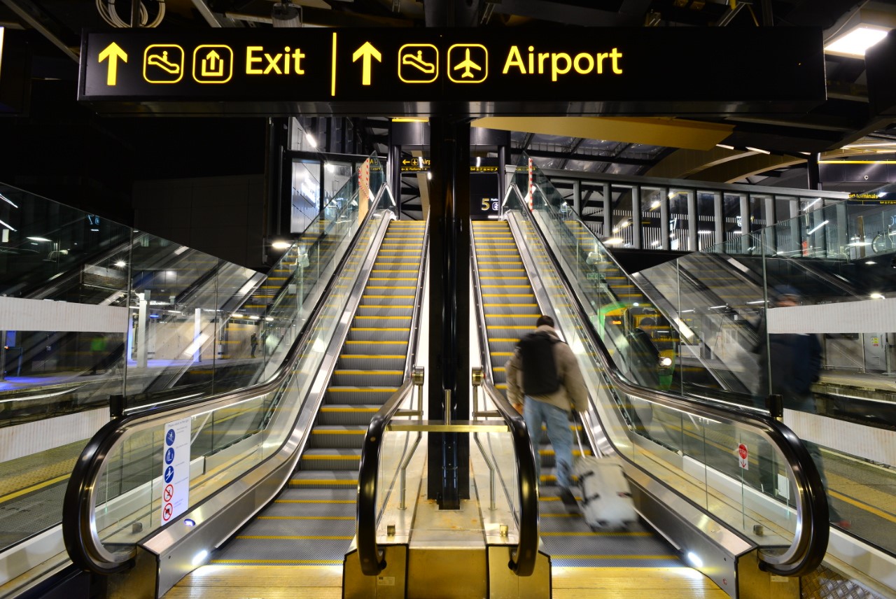
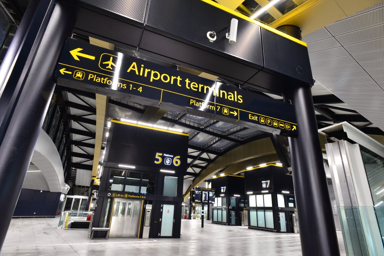
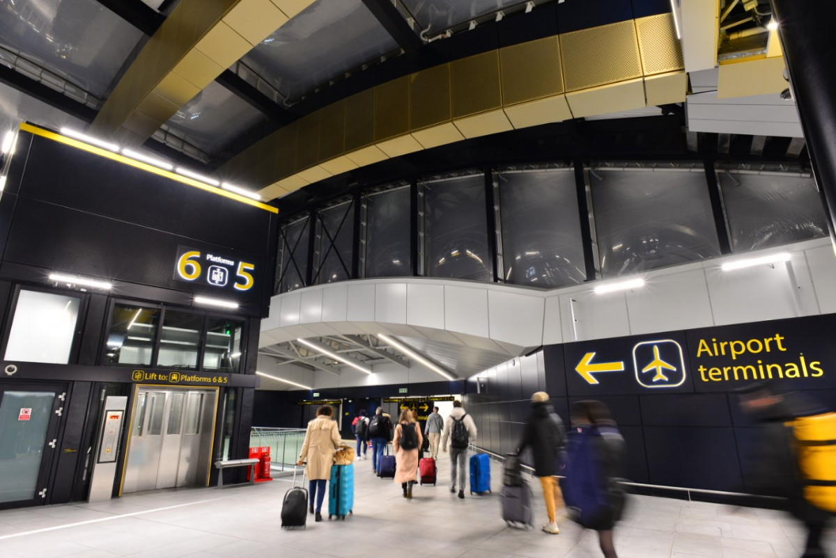
The project is a bold departure from the traditional blue signs typically seen at Network Rail-managed stations. Embracing the iconic black and yellow branding of Gatwick Airport, the wayfinding strategy exudes a sense of uniqueness and individuality. This strategic choice not only enhances visual appeal but also strengthens the station’s identity, aligning it closely with the airport’s branding. Stakeholder engagement, involving key partners like Govia Thameslink Railway (GTR), Network Rail, and Gatwick Airport, played a crucial role in developing and refining this wayfinding strategy.
Our Solution
Mima’s approach involved creating a continuous visual journey between the plane and train through the use of Gatwick Airport’s distinct yellow and black typography and iconography. This seamless link provides passengers with a ‘Welcome to Gatwick’ experience much earlier in their journey, enhancing their sense of arrival and connection.
To develop the strategy and design, Mima conducted a series of workshops, utilising mock-ups, diagrammatic elevations, and a 3D model. This collaborative process with Systra, GTR, Network Rail, and Gatwick Airport ensured that the design was both practical and visually appealing.
One of the stand-out features of the design is the use of supergraphics across the concourses. These large- scale graphics help passengers to orientate themselves at a glance and to keep moving themselves, reducing travel stress and congestion.
The construction of a brand new “arrivals” concourse facilitates the streamlining of passenger one-way flows into separate arrivals and departures - increasing capacity but setting a unique challenge for the wayfinding system. The newly developed “arrivals” concourse presents a large sweeping arched ceiling adding a sense of height and direction, it draws the eye upward towards the tall lift structures, providing an excellent high visibility location for the new signage.
The existing ticket hall was re-imagined and enlarged - now a dedicated “departures” concourse, a series of totem-style signs were introduced at the escalator entry points. These signs feature large platform numerals and a prominent triangular 3D shape, effectively acting as beacons to intuitively direct passenger toward their platform. The same design language was applied at thresholds leading to lifts - to provide equal prominence and emphasis on the step-free route to the platforms. These supergraphic treatments were developed in close collaboration with the architects to achieve seamless integration, enhancing intuitive building legibility.
The wayfinding project worked closely with Network Rail, the Architects and access consultant to develop a tactile and Braille signage solution to support the journeys of blind and partially sighted passengers on the obstacle free route to and from the platform.
The design also focuses on combining and enlarging messaging to reduce signage clutter, enhancing architectural legibility and improving navigation through vertical circulation and exits. This thoughtful approach ensures that passengers have a smoother, more enjoyable journey through the station.
Mima’s wayfinding strategy and design underscore the importance of strong connections to the airport terminals. By improving wayfinding, the project not only adds value to the overall passenger journey but also sets a new standard for travel convenience and comfort at Gatwick Airport station.
